
This week, we had the chance to connect with Carling Spelhaug from AMP Robotics, a company that is pioneering artificial intelligence, robotics, and infrastructure for the waste and recycling industry.
Carling manages public relations and communications for the company. Her role is to share the story of how the technology is helping the industry unlock the power of AI-driven automation and data capture to make recycling operations more efficient; AMP Robotics ultimately increases landfill diversion and the availability of material for reuse, contributing to a circular economy and protecting the environment.
Let’s learn more about sustainability within the waste and recycling industry from Carling!
Why do you think climate change and sustainability is such an important topic today?
Climate change is a critical issue today because we’ve run out of time not to act, and there’s a lot at stake if we simply maintain the status quo. When it comes to recycling, it’s a process that helps preserve energy and lower carbon emissions. Extracting natural resources for all the things we consume accounts for half of global greenhouse gas emissions. The material recycled annually today in the U.S. saves the equivalent of 410 million tons of GHG emissions—that’s equivalent to the amount of energy used in 43 million homes in one year, according to the Institute of Scrap Recycling Industries (ISRI). And with our application of AI, robotics, and data capture, we’re aiming to boost that recycling rate, along with the emissions impact.
Our mission is to enable a world without waste, and while that’s a lofty goal, our technology is lowering the cost of sorting, which we believe will help make recycling the most dominant form of waste management. Better resource management is key to a more sustainable and viable future.
What do you envision your industry looking like 10 years from now?
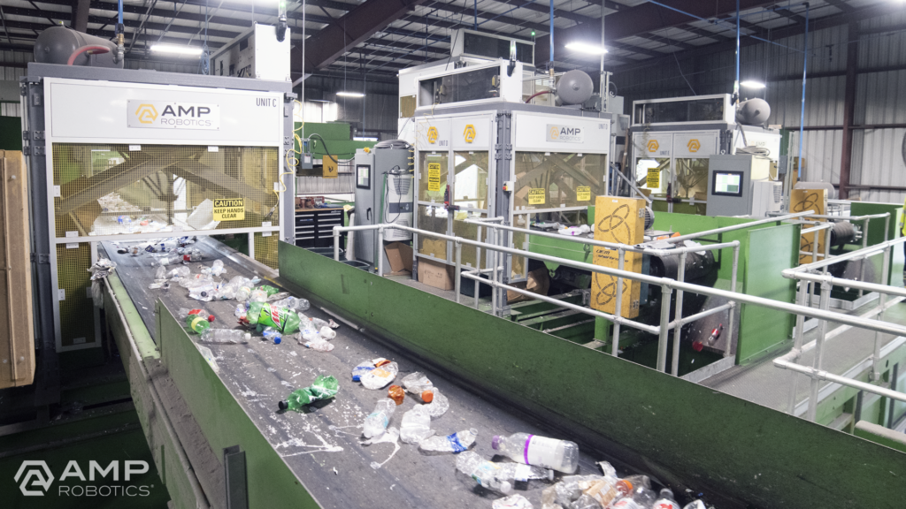
AI is enabling economic improvements to happen via retrofits within today’s waste management infrastructure. The industry is adopting our technology at a rapid pace. For example, there were about 100 robots installed in materials recovery facilities in 2019, and now, that number has more than doubled. AMP alone has nearly 200 robots installed in North America, Asia, and Europe, and we expect this proliferation to continue.
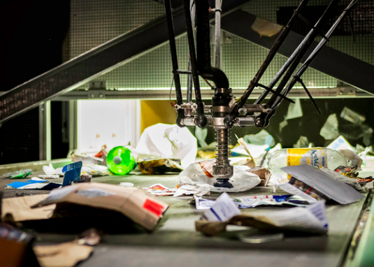
As we look to the future, it’s AI that offers great potential to continue to transform recycling. Robots are one application of AMP’s core AI technology; each robot leverages AI to digitize the objects that pass by on a conveyor belt. Looking for specific colors, shapes, textures, logos, and more to recognize patterns correlated with material type, the platform learns to identify objects in the same way a human does. The software understands the heterogeneity, value, and contamination in material streams. It grows smarter and more effective over time as our fleet of AI-guided robots expands. We’re also applying our technology to expand new infrastructure that turns what was previously considered contamination into new material markets via secondary sortation.
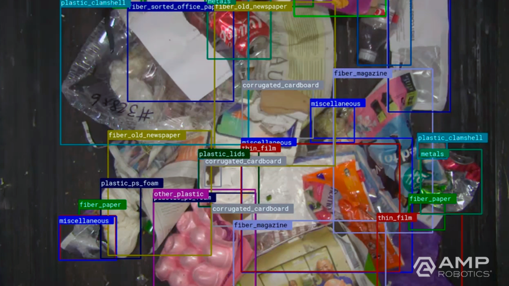
The artificial neural network of our AI platform encompasses the largest known real-world dataset of recyclable materials for machine learning. We’re capturing data on more than 10 billion objects annually, and that number continues to compound. We can classify more than 100 different categories and characteristics of recyclables across single-stream recycling, e-scrap, and construction and demolition debris.
As its sophistication grows, AI will take on an increasingly significant role in helping operators understand not just the what, but the why, behind changes in the material they’re processing. Advancements in AI and data capture provide opportunities for consumer packaged goods companies, retailers, and packaging manufacturers to understand the flow and recovery of their specific containers and packaging, thereby supporting producer initiatives to increase recycling rates and create new value streams for recyclables. Data collection, measurement, and material characterization for recycling also create a mechanism to support federal, state, and local government programs focused on landfill diversion goals and recycled content standards to advance a more circular economy.
What can the average person do to make a difference?
Take the time and effort to recycle right, according to your local guidelines, as well as strive to reduce your consumption and reuse materials. For example, just because you can recycle a plastic water bottle doesn’t mean you shouldn’t use a Nalgene or some other reusable container for as part of your daily routine. And despite the doom-and-gloom headlines you might read, I’d encourage anyone feeling discouraged about recycling or that your efforts to recycle properly don’t matter not to give up! The issue is not that recycling inherently can’t work. Plastics, metals, and paper all have real value; the problem is that the cost of sorting erodes it. By reducing the cost of sorting, the margin that can be extracted on all of these materials increases, and a natural incentive arises to capture as much as possible. The challenge is immense, but we’re confident we can significantly reduce the historical processing cost challenges, thereby increasing recycling rates and ensuring a quality supply of recycled content for reuse.
Green Success Stories is a television show, podcast, social media, and news platform, hosted by Dylan Welch, that highlights climate change scientists, renewable energy experts, and clean tech entrepreneurs by giving them a voice in the mainstream media. The Green podcast highlights leading experts in cleantech, sustainability, media, finance, and real estate. Tune in and subscribe to the podcast on Apple or Spotify to listen to interviews with leading cleantech and sustainable experts. If you are interested in being featured on Green, click HERE.


